Color Selection for Image Colorization
AKVIS Coloriage AI offers several ways to select colors in the Classic mode. In the AI mode, the neural network chooses colors. Also, color selection options are useful for some post-processing tools that can be applied in both AI and Classic modes in the After tab.
In the AI mode, you can use the Color and Swatches palettes as well as the Color History to select color for the brushes.
In the Classic mode, the Coloring tab contains the Color Library, the Sample Image section, the Color History, as well as the Color, Swatches and Multicolor palettes.
When selecting colors, please take into account that the colorized photo will look more natural if you apply less saturated colors.
The Color History keeps the last used colors. Once you draw with a color, it appears in the History, so you can quickly back to one of the recently applied tints.

When working with this palette, you select a color from the spectrum displayed on the color scale. The cursor here takes the shape of an eyedropper. To set a new color, just click the eyedropper inside the scale. The current color is displayed in a color box. Double-clicking on it brings up the standard Select Color dialog.
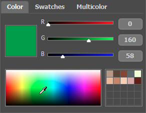
You can change the tone of a color or get a new color altogether by adjusting the sliders or entering new values for color components in the input fields.
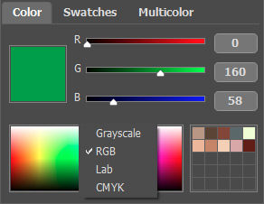
Right-clicking on the same box opens a menu of available color modes: gray tones (Grayscale), RGB, Lab, and CMYK.
The gradient line above the Color palette will show the selected color and its shades according to their brightness.
Below the gradient line you can set the brightness of the current color. By default the brightness range is complete, i.e. the black pixels on the image correspond to the darkest shades of the selected color, while the white pixels correspond to the lightest shades of the selected color.

To change the brightness range, move the markers of the black and/or white points on the gradient line. Thus you set the darkest or/and the lightest possible color shade for the object. If you set a darker shade for the white marker, you will be able to color a light object a darker color; if you set a lighter point for the black marker, you will be able to color a dark area a lighter color. You can not reduce the range more than twice.

You can store your favorite or frequently used colors in a special mini-palette.

To add a color to the mini-palette, click the selected color and drag it a box. To change the main color to that in a box, left-click the box. To remove the color from the box, right-click the box.
The Swatches palette contains a collection of frequently used colors. To select a color from the set, just click it with the left mouse button. As in the Color palette, the selected color will be shown in the color box.
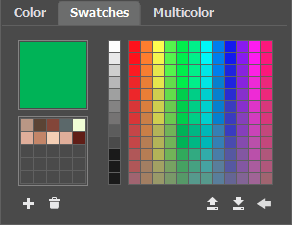
The buttons at the bottom of the palette have the following uses:
- The Add Swatch button
 adds the current color to the collection of swatches.
- To delete a color drag it to the basket
 or choose Delete Swatch from the menu.
- The Save Into File button
 opens a dialog where swatches can be saved (files ending in .swatches).
- The Load From File button
 loads a saved collection of swatches so that they can be used again.
- The Reset Defaults button
 resets the collection of swatches to their original settings.
Color Library
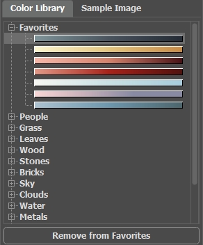
The Color Library contains colors that are difficult to pick out: the color of skin, hair, lips, grass, trees, stones, etc. All colors in the Color Library are divided into groups in accordance with their function. To select a color from the Color Library:
- Select a color group from the tree by left-clicking it. The colors within the group represent a gradient.
- Select a gradient by left-clicking it. As a result the chosen color appears in the upper gradient line under the Color Library. The marker shows the color you clicked on.
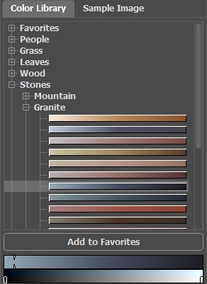
- Select a color on the upper gradient line by left-clicking it. The marker will fix this color and the lower gradient line will show the shades of the selected color according to their brightness.

To save a gradient in a separate group, select it and click the Add to Favorites button. To delete a gradient from the Favorites group, select it and click the Remove from Favorites button.
Sample Image
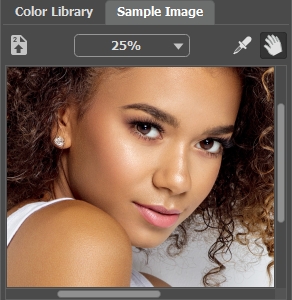
In this tab, you can pick colors from any other image with the eyedropper ![]() . The active tool (for example, Pencil
. The active tool (for example, Pencil  ) will automatically start drawing with the selected color.
Load an image using  or double-clicking within the empty space in this tab or dragging the image into this tab.
Right-click the button
  to display a list of recently used files.
To zoom in or out on the sample image, use the drop-down list.
Eyedropper Tool
You can also select a color directly from the image. To do this, enable the Eyedropper tool ![]() and left-click any point of the image, including drawn strokes.
and left-click any point of the image, including drawn strokes.
When you click in the image with the eyedropper, it displays a Color Ring with 5 sectors that shows the information about the colors in this area:
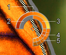
1. Gradient line with the current color in the center, on the left side is +30% black, and on the right side +30% white.
2. The previously selected color.
3. The current color of the pixel where the cursor is.
4. Colors of surrounding pixels.
5. Average colors from areas of 3x3, 5x5, 11x11, 31x31, 51x51, 101x101 px (around the eyedropper's tip).
Hint: The Color Ring helps to select colors more precisely. If it's hard to catch a certain color, select the desired tint on the ring while holding the Ctrl-key.
And let's repeat: The colors on the photo will look more natural if you select less saturated colors.
