How to Achieve a Natural Colorization in Classic Mode
The author of this example is Jean-Claude Grégoire. You can colorize this photo yourself using the half-finished materials that we give you. Download an archive containing the original image and the file with the strokes (*.strokes). Read the instruction here to see how AKVIS Coloriage AI works.

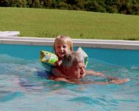
Jean-Claude Grégoire tells us how to achieve natural colorizations.
For this tutorial, use any graphics editor, for example, AliveColors, and the AKVIS Coloriage AI plug-in (Classic mode).
This tutorial assumes you already are familiar with the AKVIS Coloriage AI plug-in, for having tried it out on a few black and white photos, because it applies to a somewhat difficult case (swimmers in a pool), and demonstrates the use of several rather advanced techniques for getting better results.
It emphasizes:
- the use of the Select Color dialog,
- selecting colors from a color photo,
- the particular way of drawing the strokes for the depiction of water,
- the use of a copy of your colorized image in a second layer with Overlay as blending mode, for enliving your work,
- the final touch by adjusting the saturation and the brightness of the image with an adjusting layer hue/saturation,
- the optional use of an unsharp mask.
Most often, the main color of the water in a swimming pool may be blue or turquoise, depending on the color of the walls and the bottom of this pool. But, actually, there are many reflections and refractions of the light in the water, which slightly modify this main color. Furthermore, the color of the water and of the reflections and refractions modifies the color of the swimmers' skin in a variable and very subtle way. And all those color variations are a source of some definite difficulties when you're trying to colorize swimmers in a pool.
If you load several color photos in a photo editing program like Photoshop or Paint Shop Pro, and use the eyedropper tool, you'll see that the hue of one person's hair or skin isn't the same everywhere - i.e. the place of these shades on the chromatic wheel (often given in degrees from 0° to 359°, as in Adobe Photoshop, but there exist other systems) is not the same: here the hair (or the skin) will have a yellower shade, and there a redder one, etc.
So if you want to colorize hair or skin in a very realistic way, you'll have to use various hues for the hair, various other ones for the skin, etc. For example, if you download the strokes file for this tutorial, you will be able to see - when using the Select Color dialog(see below) - that I used two different hues (H = 4° and 25°) for the hair of the child, and three (H = 0°, 15° and 22°) for the man's hair. Ditto for the skin, etc.
Some years ago I was taking color photos of some friends and of my family playing in a swimming pool. But I came to the end of my film and I had to continue my shots with a black and white one. So now, I find myself at the same time with black and white and color photos of this nice summer afternoon.
Fortunately, AKVIS Coloriage AI makes it possible to colorize one of these black and white photos, drawing my inspiration from the color ones. Now let's start.
- Step 1. I scan the black and white photo and open it in AliveColors.
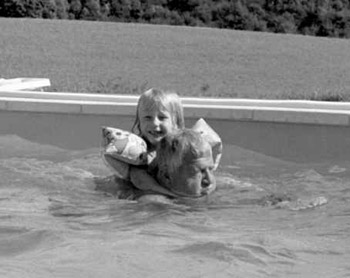
Fig. 1. The original black and white photo - Step 2. First of all, you have to make sure that this black and white image is in RGB mode. If it is not the case, switch it to RGB mode.
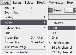
Fig. 2. Switch the image in RGB mode - Step 3. Here is my trick for choosing the good colors for the water and the skin of the swimmers. I take two color shots of swimmers in the same swimming pool. I crop them to their most useful part and resize them so that their height is about 600 or 700 pixels (i.e. about 2/3 to 3/4 of the height of the black and white image, which is 911 pixels).
- Step 4. For personal convenience (so that I won't confuse them) I save the three images with different names and close their files in AliveColors.
- Step 5. I re-open the initial black and white image (size 1146 x 911 pixels) and I choose Image > Canvas Size > Width: 1800, with an anchor as shown on fig. 3. Why "1800"? Because so, I get enough place for putting in my color images. I load the color images in AliveColors too, where it won't be very difficult to put the three images "next from one another".
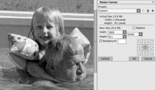
Fig. 3. Change Canvas Size - Step 6. I move the layer "background" of the colored images onto the black and white image, by clicking on them and dragging them onto the black and white image (in RGB mode: otherwise it won't work!). I change the size of these color image with the command Ctrl+T and I move them onto the right place (same command or Move Tool: V) as seen on fig. 4, where the layers palette shows very well the disposition of the three layers. Then I crop and flatten the image.
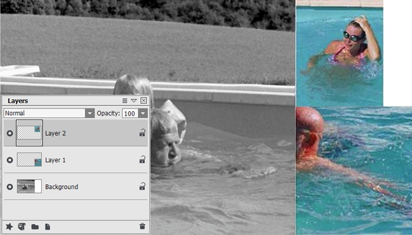
Fig. 4. Combine these three photos
- Step 7. Now we can call the AKVIS Coloriage AI plug-in. We'll use it in the Classic mode.
- Step 8. We have to be sure that the plug-in won't change the colors of the two color photos. Therefore, I select the Keep Color Pencil
 and draw a straight line between the black and white photo and the color images (fig. 5: red arrows). Beware! The keep-color line should go beyond the photo frame, so that there were no gaps left between the left and the right side of the image.
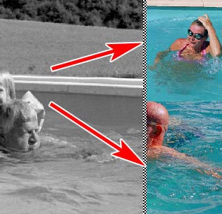
Fig. 5. Keep-color line - Step 9. I click on the Eyedropper button
 and then somewhere on the arm of the swimmer of the first color photo, to get a first skin color.
- Step 10. Now I double-click on the rectangle on the right of the Color palette to open the Select Color dialog.
You can see that the skin color I've just picked has the following values:
- Hue: 2
- Saturation: 35
- Value: 217
- Red: 217
- Green: 188
- Blue: 187
The Red-Green-Blue values don't interest us for the moment, but look at the other ones, particularly the Saturation and the Value (here "Value" means "Brightness" or "Luminosity").
- The higher the Saturation = the stronger (or the purer) the color - i.e., the closer to the colors of the rainbow;
- The lower the Saturation = the grayer the color (but remember that the grayscale goes from black to white!) - so, if the saturation is zero, the color can be white, black or any gray;
- The higher the Value (Brightness/Luminosity) = the purer the color (the closer to the rainbow colors);
- The lower the Value (Brightness/Luminosity) = the blacker the color;
- If you reduce the Saturation and the Value at the same time, you add white and black to your color at the same time, so you'll get grayer and darker colors (because gray is a mixing of black and white).
- As for the Hue, it is characterized by its place on the standard color wheel, and defined as a degree from 0° to 360°. So 0° is red, 30° is orange, 60° is yellow, 120° is green,...and finally 300° is magenta and 360° is red again.
So, theoretically, this Select Color dialog should help us to very easily correct a stroke which should be too little saturated (too gray), or too colored, or too dark, or to light, simply by modifying the digits in this window. The Hue is easily changed too by working on its value in degrees.
This is the theory, but in the practice, with AKVIS Coloriage AI, it's another story. Actually, if you read the Coloriage AI userguide carefully, you should have noticed the following sentences: "A light grey object from the original image can not be painted in a dark color [...] The same is true with dark areas: it is impossible to change the color of a dark area in the original image into a lighter color". It clearly means that, if you change the Value (Brightness) of the color choosen for a stroke, you won't modify the brightness of this color in the final result. But, then, what will change? Well, actually, reducing the Value of a pencil stroke will have about the same result on the colorization as reducing the saturation.
Fig. 7 demonstrates that very well.
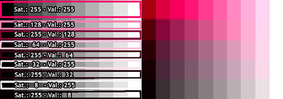
Fig. 7. Adjust saturation and brightnessOn the left side you see red, pink and darker strokes on a grayscale in AKVIS Coloriage AI. The Hue is always the same: 336°, which defines a bluish shade of red.
As you can see, the Saturation and the Brightness (Value) of the strokes decrease alternately from top to bottom, and by the same value, while the other parameter remains at the highest value, on the following way:
- 1. Saturation: 255 - Brightness: 255;
- 2. Saturation: 128 - Brightness: 255;
- 3. Saturation: 255 - Brightness: 128;
- 4. Saturation: 64 - Brightness: 255;
- 5. Saturation: 255 - Brightness: 64;
- 6. Saturation: 32 - Brightness: 255;
- 7. Saturation: 255 - Brightness: 32;
- 8. Saturation: 8 - Brightness: 255;
- 9. Saturation: 255 - Brightness: 8;
On the right side you see the result of the colorization: it's the same for 2 and 3, 4 and 5, 6 and 7, 8 and 9. This proves that, in AKVIS Coloriage AI, reducing the Saturation or the Brightness (Value) has exactly the same effect.
Fig. 8 shows another interesting phenomenon: from darker to lighter, the Hue does not remain the same with every color. Particularly red (Hue 0°) and orange (Hue 30°) show some color sliding from red to yellow. Yellow (Hue 60°), green (Hue 120°) and cyan (Hue 180°) strokes give nearly black on the darkest gray stripes and cannot reach the white color on the lightest one.
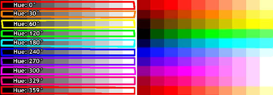
Fig. 8. Changing huesThese peculiarities are a very intelligent feature of AKVIS Coloriage AI, the result of which is the realism of the colorization.
- Step 11. To illustrate the use of the Select Color dialog, I begin with rapidly drawing some strokes (fig. 9), using the Color Library, except for the skin, as I've just said, and for the water (and the wall of the pool), for which I pick a color in the color images.
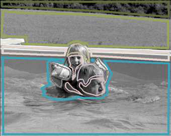
Fig. 9. Color strokesThe result is shown on fig. 10: the color of the trees, the grass, the pool and the water are not too bad. But the skin and the hairs have to be ameliorated.
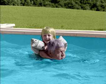
Fig. 10. The colorization result - Step 12. Let's start with the skin: it has too little saturation (= not enough color), so we can try to increase the saturation, which is "35": after some trials, I find that "69" is a good value, but now the hue looks too violet, so I modify the hue, from "2" to "12". It's very easy to change the color of all the skin strokes in one click, with the help of the Magic Tube
 . So, in a few minutes, we get a good color for the skin (HSV: 12-69-217). But in fact, I find it'll be still better to have a second color for the shadowed parts of the skin: less orange (redder), more saturated and darker: Hue: 3 - Saturation: 113 - Value: 180. For the man's skin, I help myself in the 2d color photo, where I pick up a third color with the Eyedropper, yet more saturated (HSV: 2-125-280). - It should be noted that some other AKVIS Coloriage AI tutorials already show that two or three colors were used for the skin of the face.
- Step 13. I continue in the same way, picking up colors in the color photos with the Eyedropper and progressively adjusting them with the help of the Select Color dialog, which allows me to get very subtle nuances in my colorizing work.
- Step 14. As I already said above, the water in a swimming pool has many various shades, due to the reflection and to the refraction of the light on its surface. So we are lead to use, and often to alternate, many differently colored pencil strokes for its colorization.
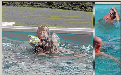
Fig. 11. Color strokes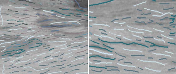
Fig. 12. Color strokes on the waterAs you can see on fig. 11 and yet better on the zooms on fig. 12 (both show the final stage of the strokes), the strokes in the water remind of the way the French Impressionists painted the water at the end of the XIXth century, of which I give you an example on fig. 13, which shows a fragment of a painting after the renowned work of Claude Monet "Bathing at La Grenouillère". In this work, the alternation of very contrasted colored brush strokes for painting the water is very characteristic of the style of the Impressionists.
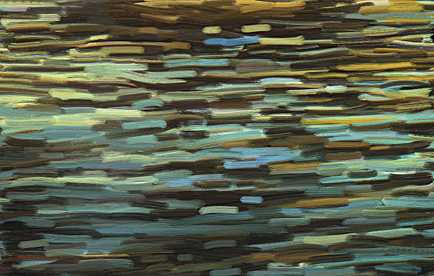
Fig. 13. A fragment of a Claude Monet's painting - Step 15. As explained in the AKVIS Coloriage AI userguide, I press successively the button
 to process the image and the button
  for applying the colorization result and closing the plugin.
- Step 16. The result of the colorization in shown on fig. 14: not bad, but I'm a perfectionist and I still want to improve it. I crop the image for getting rid of the two colored models.
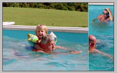
Fig. 14. The colorization result" - Step 17. Now saving the image file with another name (e.g. "first_result") is a useful caution.
- Step 18. To enliven the picture, I duplicate the background layer, and choose the blending mode overlay for the duplicate ("Layer 1" on fig. 15), with an opacity of only 40%, so that I don't get a too contrasted image.
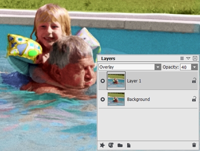
Fig. 15. Overlay mode - Step 19. Since the result is now too light and too saturated, I add an Adjustment Layer Hue/Saturation, as shown on fig. 16, with the following settings: Hue: 0 - Saturation: -5 - Lightness: -5.
It should be noted that one has to grope a bit for finding the best settings for the opacity of the layer in Overlay mode and for the Adjustment Layer Hue/Saturation, which can vary from one photo to another.
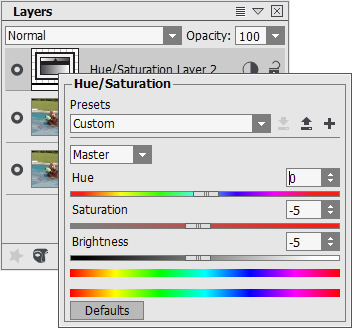
Fig. 16. Add an adjustment layerFig. 17 shows the result at this stage.

Fig. 17. The correction result - Step 20. I flatten the image and save it under the name "2d_result".
- Step 21. (This last stage is only optional.) I love every color, but for getting a little more depth I can apply the filter Unsharp Mask (choose "Effects > Sharpen > Unsharp mask") with the following settings: Contrast: 50 - Radius: 0.5 - Threshold: 0 (fig. 18) (Beware you don't choose too high values for the Contrast and the Radius, because the result could be disastrous!).
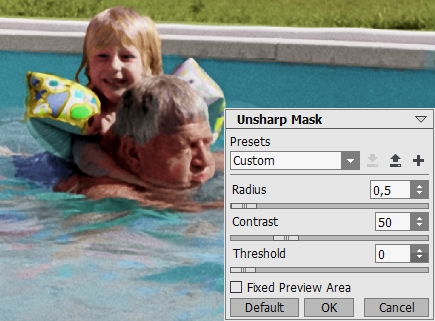
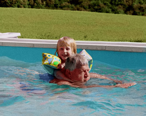
Fig. 18. Unsharp Mask Filter - Step 22. I Save the final result with an evocative name. You can see this photo on fig. 19. Isn't it a lovely image?
If you have the possibility of working with two photo editing programs (e.g. Adobe Photoshop and The Gimp) you can open both at the same time, load the black and white photo in the first one and one (or more) color photo(s) in the other one - or vice versa. This can be useful for colorizing very large photos.
Then you'll use the Eyedropper tool for picking colors in the program which contains the color photo, and you use the Select Color dialog in the second program for reproducing these hues by copying the digits you got in the first one.
But beware! The Hue/Saturation/Value digits are not the same in all graphic programs (*), so you have to refer to the Red/Green/Blue digits, which are always the same, from 0 to 255 for each color. Another possibility is to load AKVIS Coloriage AI in both programs, so you can easily use exactly the same Select Color dialog for the black and white and for the color photo.
In any case, if the original black and white photo is not too large, working with only one program is easier and faster than working with two.
_____________
(*) For the Hue, some programs use the degrees (from 0° to 359° or 360°), some others use values from 0 to 100 or from 0 to 255.
For the Saturation and the Brightness (=Value), Photoshop gives percentages, so the digits go from 0% to 100%, while other programs give values going from 0 to 240 or from 0 to 255.
