How to get a nice sepia photo
Jean-Claude Grégoire tells us how to convert a regular grayscale photo into a sepia toned photo.
"For this tutorial I used Adobe Photoshop and the AKVIS Coloriage AI plug-in."
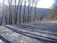 |
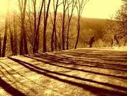 |
If you start with a color photo, go to Step 1.
If you start with a black and white photo, go to Step 4.
Starting AKVIS Coloriage AI on the color photo is certainly possible too, but it's more difficult to get a good final result.
For getting an excellent black and white photo I'll explain what I consider the best method, because you remain the master of every parameter. Actually, with the following methods, which are the simplest, you cannot control anything:
- main menu: Image -> Mode -> Grayscale;
- main menu: Image -> Adjustment -> Hue/Saturation;
- main menu: Layer -> New Adjustment Layer -> Hue/Saturation.
As already explained in the AKVIS Coloriage AI Userguide, chapter "Selective Desaturation", you can get a black and white photo with the plugin. You just have not to use the Keep Color Pencil. The result will be exactly the same as choosing Image -> Mode -> Grayscale from the main menu (incidentally, the methods Hue/Saturation don't give the same black and white result as both these ones).
Another method consists in choosing a Channel (e.g. the red channel, or the green one, etc.) and to eliminate the other ones, but this isn't a quick and easy method and you cannot modify what's in this channel.
So I prefer to use the following method.
-
Step 1. Fig. 1 shows the original color photo.

Fig. 1. A Color PhotoI start looking at every possible channel in RGB, Lab and CMYK color modes - by going in the channel palette and successively clicking on each channel (fig. 2 and 3):
- Red
- Green
- Blue
- Lightness (in Lab mode)
- Cyan
- Magenta
- Yellow
- Black
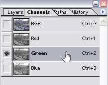
Fig. 2. Channels Palette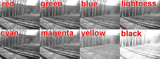
Fig. 3. ChannelsAnd I notice that some elements are better on the red layer, other ones on the Cyan one, etc. So I'll try to make a mixing of several channels. I now have an idea which channels will be the best ones for the mixing.
-
Step 2. Therefore, the easiest way is to call a Layer -> New Adjustment Layer -> Channel Mixer in the mean menu (fig. 4), where it is compulsory to check the Monochrome case. Then I move the sliders until I get the best result. Here you can see that I worked in RGB mode with the following settings:
- Red: +20
- Green: +124
- Blue: -24
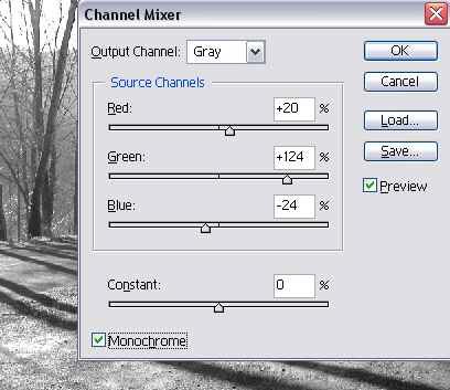
Fig. 4. Channel MixerBut it is also possible to work in CMYK mode. Then you'll have 4 channels to mix.
- Step 3. As soon as I'm satisfied with the result, I flatten the image and choose in the main menu Image -> Mode -> Grayscale, to get a black and white image.
-
Step 4. It's now necessary to increase the contrast. Actually, the black and the dark grays of the black and white photo will fade when becoming sepia in the final result. If there is not enough contrast in the black and white photo, the result will be drab.
Choosing Layer -> New Adjustment Layer -> Curves in the main menu (fig. 5) is the best method, because it permits to act on the 256 levels of the grayscale. In general, a curve in "S" gives the best result.
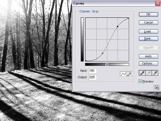
Fig. 5. Brightness AdjustmentHere are the settings I've choosen for the control points (these will be different for each photo):
- Input: 0 - Output: 0
- Input: 100 - Output: 45
- Input: 190 - Output: 205
- Input: 255 - Output: 255
- Step 5. Once satisfied with the result, I flatten the image and I switch it to RGB mode.
- Step 6. Now's the time for calling the AKVIS Coloriage AI plugin.
-
Step 7. I choose the following color in the Color Selection Standard Dialog (fig. 6):
- Red: 179,
- Green: 126,
- Blue: 40,
what corresponds to:
- Hue: 37
- Sat: 198
- Val: 179
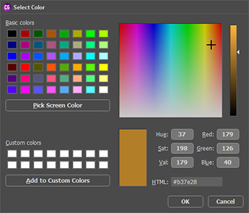
Fig.6. Standard Color Selection DialogShould you prefer another sepia shade, you could easily modify this setting. Here the Hue number is 37° (fig. 6). For a more yellow shade you'll have to raise this number (e.g. up to 50° or something), and to reduce it for a more red shade (e.g. down to 25° or something).
-
Step 8. I select the Pencil tool
 from the Toolbar and I draw an outline all around the photo with the choosen color (fig. 7) - drawing a big cross through the photo will give exactly the same result.
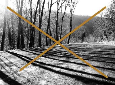
Fig. 7. Draw strokes -
Step 9. I click the button
 to process the image and I look at the result in the After tab: it's splendid (fig. 9)!
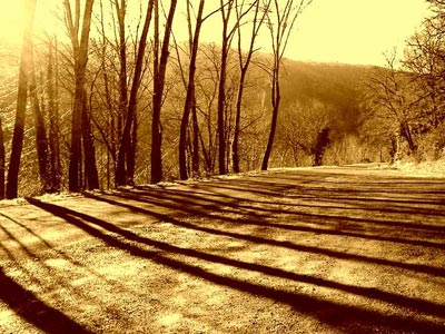
Fig. 8. Sepia toned photo -
Step 10. I click the button
 to apply the colorization result and close the plugin, and I save the final image.
-
Step 11. (Optional). It's still possible to change the shade of the sepia by applying an Adjustment Layer Hue/Saturation and changing position of the "Hue" slider. For example : -10 will give a redder sepia, +10 a yellower one (fig. 10).
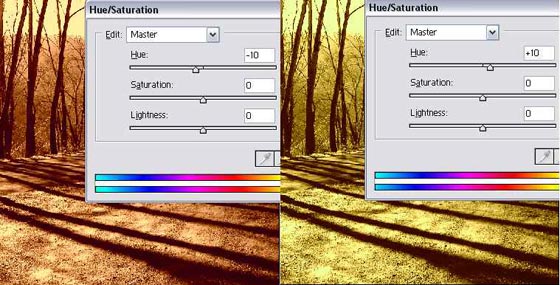
Fig. 9. Change Hue
- Calling the AKVIS Coloriage AI plugin on a color photo.
Applying steps 6 to 10 to a color photo (fig. 10), will often give a drab result (as shown on fig. 11), unless you have managed to get a excessive contrast of the color photo. But this is very difficult to estimate correctly, because for a good sepia result this color photo will become ugly (fig. 12). Nevertheless, it is possible to get a good result in some cases with this method too (fig. 13).
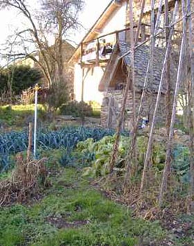
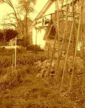
Fig. 10. A Color Photo Fig. 11. A Soft Photo in Sepia 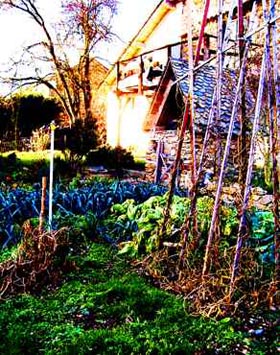
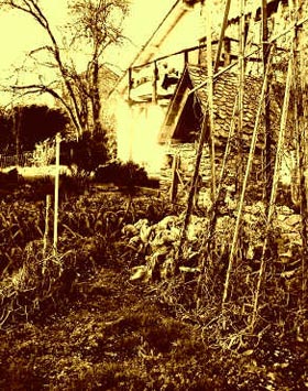
Fig. 12. Improve contrast
to get a better photoFig. 13. Sepia toned photo - Can we invert step 4 and steps 6 to 10?
It should be noted that applying the same Adjustment Layer -> Curves (with the same settings as described above, but only on the RGB channel) after colorizing the black and white photo in sepia with AKVIS Coloriage AI will give a totally different result: much more saturated (fig. 14).
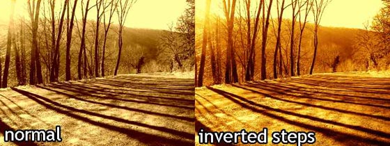
Fig. 14. Changing the order of steps
