Simple Approach For Coloring Pictures
This tutorial has been created by Jim.
The AKVIS web site (akvis.com) shows how to color people in black-and-white photos. This tutorial shows how to quickly color less detailed photos, and still get stunning results. It also gives some insights into the software, and how to begin to maximise its potential. The techniques used are suitable for both beginners and more experienced users.
 |
 |
| Original Image | Result |
This Tutorial shows how easy it is to get good results, and also how it is possible with a little extra work (and time) to get excellent results!
Hopefully, it will help the new users of the AKVIS Coloriage AI software get up and running quickly, and the tips included could possibly also help the more experienced user.
How to color a landscape using some fairly simple techniques:
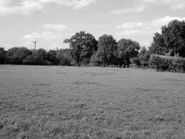
Figure 1 below shows the original Black and White photo. (The field is behind our house!)

Fig. 1
-
Hint: Download an archive containing the original image and the file with the strokes (.strokes).
The AKVIS Coloriage AI Color Library is a good starting point to explore the colors needed. In this example, again to keep it simple, I shall only use those colors from the library section Grass.
The Library contains some very useful colors, although unfortunately it is fairly hit and miss to know what the actual color will look like in the final picture. The Brightness Preview button ![]() is only a general guide, and so the selection process can be a fairly time consuming process of trial and error.
is only a general guide, and so the selection process can be a fairly time consuming process of trial and error.
However, I have come up with a fairly simple way to develop a crib sheet that has been very useful and doesn't take too much time. It has certainly been worth the worth the extra effort for me.
Since the color appearance will change depending upon the brightness (or darkness) of the image being used in the B&W photo, I selected each of the 15 colors from the library Grass and create vertical stripes on the work photo. The result is shown in Figure 2.
Tip: Just click anywhere on one of each of the 15 color bars to select the color.
Note: The actual final color will be the same regardless of what appears in the large square in the lower right corner! Don't do what I did, and spend hours thinking you can fine tune the final colors using the top gradient bar - you can't!
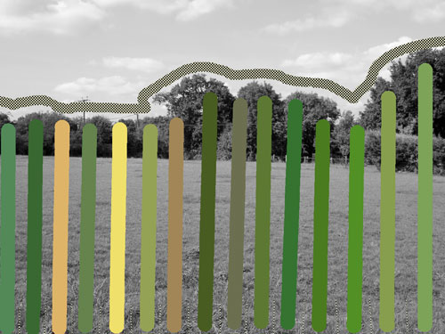
Fig. 2
Tip: To draw straight lines: Press and hold Shift; click mouse at start point; click mouse at end point; release Shift key. Job done!
The completed result is shown in Figure 3. Notice how different the actual colors now appear!
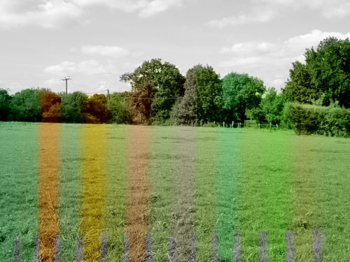
Fig. 3
Tip: To be able to identify the colors more easily, insert a short line using the Keep Color Pencil ![]() at the bottom of the page between each different color. I used a small pencil size as can be seen on Figure 2. The final colors can easily be numbered by hand for easy identification later.
at the bottom of the page between each different color. I used a small pencil size as can be seen on Figure 2. The final colors can easily be numbered by hand for easy identification later.
By studying the picture carefully, one can see the relationship between the actual picture and the various colors. This can be very helpful in narrowing down the color choices that are best suited to the actual picture.
Tip: Either print the sheet to use as a hard copy reference, or alternatively save the file so that it can easily be opened with a picture viewer (e.g. Windows Picture Viewer). This can be kept open on the desktop for reference as required.
For my picture, color № 14 (counting from the top of the library list, and from the left in Figure 3) seemed to be most suitable for the whole picture, and a couple of quick lines will quickly color the picture.
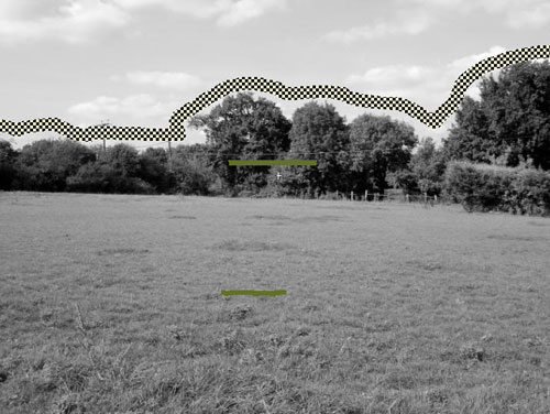
Fig. 4
Note that the sky has been protected using the Keep Color Pencil ![]() so that we can just focus on the green area. Coloring the sky after the grass has been completed is very easy, as we shall see later.
so that we can just focus on the green area. Coloring the sky after the grass has been completed is very easy, as we shall see later.
The end result is Figure 5.
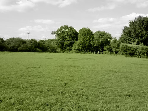
Fig. 5
Not bad for a few minutes work, but could be better.
Adding a second color (Grass № 9 - a single short horizontal stroke of color at the end of the field) adds texture to the grass and improves the image - as in Figure 6.
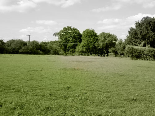
Fig. 6
And further refinements by adding Grass № 5, Grass № 6, and Grass № 7 really help to give character and depth to the foreground, and help the perspective.
Figure 7 shows pretty decent (and quick) grass coloration work.
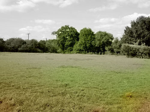
Fig. 7
Look at the stroke image (Figure 8) which shows some interesting points.
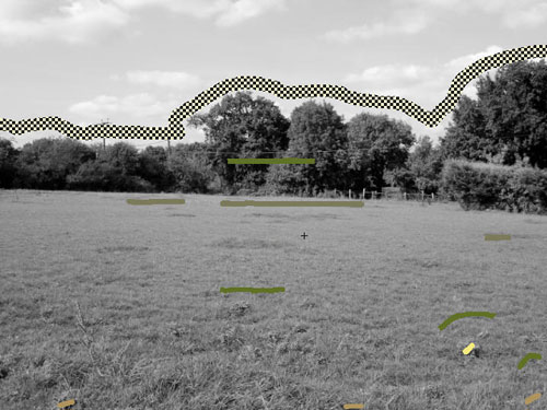
Fig. 8
Firstly, it's not necessary to cover the image with lots of colored lines. In fact for editing, I find it a lot simpler to try to keep the strokes short and clearly visible (Once you have tried to find a random dot of color which is bleeding into the image you will appreciate the point). Overall, it keeps the image clearer, and enables easy adjustments, should they be required (I'm just guessing here, but perhaps it might also reduce processing time, since there are fewer calculations for the computer to do?).
Secondly, notice how the colors tend to compete for space. Two color lines near each other act as a barrier, and block too much color blending. Move the lines further apart and the colors spread and blend more smoothly. The green dashes in the lower right corner help keep the two nearby lighter colors from spreading too far, but the absence of any green dashes in the left corner allows the yellow/green to spread and blend better. Only four different colors have been used on this picture.
So that was fairly straightforward, and the result is quite pleasing (except I still haven't added the sky!). However, before I do that, I wanted to share a very powerful feature of the software which wasn't fully apparent to me at first glance.
Under "Ways to select Colors in AKVIS Coloriage AI" it explains how to change the brightness range. This can be done by clicking on the slider bar below the Color Library. Either side can be moved. Reducing the left hand slider towards the centre will lighten the color, and moving the right hand slider to the centre will darken the color. But it seems that the actual color values do not change.
Recall that the colors shown in Figure 3 were only affected by the background brightness, and that moving the top slider for the color had no impact on the final color displayed. This allows the software to produce some very realistic colors, but can on occasions be restrictive. Using the brightness slider beneath the color bar enables the user to manually adjust and fine tune the picture.
In Figure 9, this fine tuning has been added, especially in the foreground where more of the same four colors have been added, but this time the brightness of the colors have been changed (as described above). Some of the foreground color brightness has been reduced by up to 30%, and in the distance for a couple have been lightened by around 20%. Careful use of this will add even greater depth to the colors. For example, in the foreground the grass gives the impression of sunshine and shadows because of the varying intensity of color. The reason why there is so much "scribble" with the strokes at the front is to limit the bleed into nearby areas as discussed previously.
I wish I had discovered this feature earlier, since I could have used it to give highlights to sun direction, shadows, and to give a point of reference where one was missing.
-
Tip: As with many things, too much is bad. Limit any adjustments to only where they are needed. This feature must be used with caution - too much and it will look odd and remove detail.
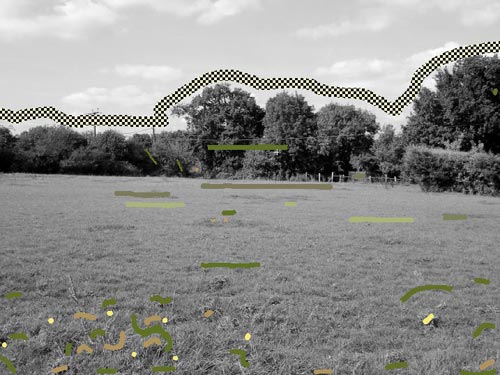
Fig. 9
Figure 10 shows the final result for the grass.
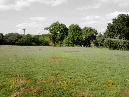
Fig. 10
Now, all that remains is to add the sky. This is very straightforward. All that was required was to erase the wide Keep Color Pencil ![]() that crosses the sky, and add a couple of strokes from the Sky Library. I used Sky № 9, and pure white (RGB 255,255,255).
that crosses the sky, and add a couple of strokes from the Sky Library. I used Sky № 9, and pure white (RGB 255,255,255).
Also, I wanted to remove the slight bleed through into the sky through the gaps in the centre tree.
Using the narrowest Keep Color Pencil, I made 3 complete loops around the gaps in the tree, drawn very crudely. Then, because Keep Color Pencil acts like a strong color repellent, add four small dabs of Grass № 14 to the top of the tree to complete the coloring. To prevent bleeding into the sky at this point, a cluster of dashes of White, Sky № 13, and Sky № 5 were used near the tree crown.
Figure 11 shows the final result.
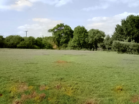
Fig. 11
I put this in a frame to sit on my desk and visitors are unlikely to realise that it started out as a black and white photo!
Hopefully, the tutorial has helped to show what can be done, how simple the software is to use, and how to get more for less!
Have fun coloring your pictures!
